Taking Websites from 'Usable' to 'Unforgettable': Smart UX for Real Engagement
Look, we all know that a usable website is table stakes these days. If folks can't find their way around or do what they came to do, you've lost them. That’s basic. But if we're aiming to build sites that really perform for our clients or our own businesses—sites that people actually connect with and come back to—we’ve got to push beyond just making things easy to use. We need to think about crafting experiences that genuinely pull people in.
Why bother with "deeper engagement"? Well, when people are truly engaged, good things happen. They stick around longer, they explore more of what's on offer, and they’re much more likely to take that next step, whether it's buying something, signing up, or just remembering the brand positively. It’s about making that digital handshake feel a bit more human, a bit more memorable. For us, this is where we can really show off our skills and deliver something special.
So, what kind of smart UX moves can get us there? Here are a few ideas that go beyond the usual checklist:
- Those Little Details: Making Microinteractions Count
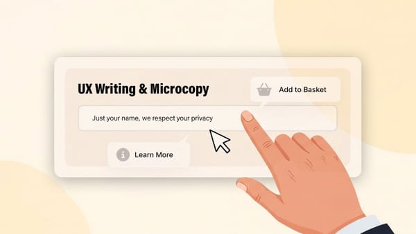
You know those tiny animations or bits of feedback when you click a button, upload a file, or even just hover over something? Those are microinteractions. When done well, they're like a subtle nod from the website, confirming your action and making the whole thing feel more polished and alive. A quick shimmer on a button, a smooth transition, or even a playful icon can turn a simple action into something a bit more satisfying. It’s about adding that layer of craftsmanship that tells users someone really thought about how this thing feels to use. - A Touch of Personal: Smart Ways to Tailor the Experience
Making a website feel a bit more personal doesn't always mean you need super complex AI. It can be as straightforward as welcoming a returning visitor by name, remembering what they looked at last time, or showing them content that’s relevant to their location. Even these small touches can make a big difference. People appreciate it when a site seems to "get" them, even in small ways. It makes their journey smoother and can guide them more effectively to what they’re looking for, which is always good for business. - Guiding with a Story: Crafting Better User Journeys
Think about how a good story pulls you along. We can use a similar idea when designing how users move through a website. Instead of just throwing information at them, we can structure key paths—like signing up for a service or buying a product—more like a narrative. What’s their goal? What information do they need at each step? How can we make that flow feel logical, encouraging, and clear? Good headlines, clear next steps, and a sense of progress can make a huge difference in keeping users on track and feeling confident. - Thinking Ahead: A Bit of Anticipatory Design
This one’s about designing for what your users might need or want, sometimes even before they explicitly ask for it. It’s not about being creepy, but about being thoughtful. For instance, if someone is looking at your contact page, maybe the map and opening hours are right there, prominent and easy to find. If they add a camera to their cart, perhaps the site suggests a compatible memory card. It’s about removing small hurdles and making the experience feel a step ahead, which users almost always appreciate.
Stepping up from basic usability to these kinds of engaging experiences is what separates a decent website from a really effective one. It’s about adding that extra layer of thought, care, and even a bit of delight. For those of us in the trenches, building and managing websites, these are the kinds of details that can truly elevate our work, make our clients happier, and deliver results that speak for themselves.