The Art of Persuasion: How UX Writing and Microcopy Can Make or Break Conversions
We all know that first impressions count online. A slick design, great images, and a smooth layout pull people in. That's undeniable. But when it comes down to guiding visitors, building their confidence, and actually getting them to do something – like sign up, make a purchase, or request a quote – it's often the words on the page doing the heavy lifting. I'm not just talking about big blocks of text, but those tiny, seemingly insignificant snippets: the labels on buttons, the instructions in forms, the little reassurances, and even the error messages. This is the world of UX writing and microcopy, and mastering it can be the difference between a visitor who gets frustrated and leaves, and one who happily converts.
Think of it this way: your website's design is the friendly face, but the UX writing is the clear, helpful voice that guides them through the conversation. If that voice is muddled, confusing, or uses weird jargon, the whole experience sours, no matter how pretty the pictures are.
So, What Exactly Is This UX Writing & Microcopy Stuff?
In a nutshell, UX writing is crafting all the text users see when they interact with a website or app. Microcopy is a subset of that – specifically those very short phrases or sentences. We're talking about:
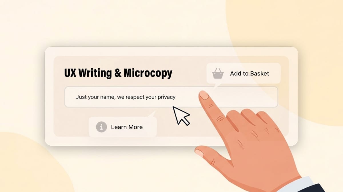
Button Text: "Add to Basket," "Request a Demo," "Learn More," "Get Your Free Ebook."
Form Labels & Placeholders: "Your Name," "Email address (this will be your username)," "Password (must be 8+ characters)."
Error Messages: "Oops, that email doesn't look right. Could you check it?" instead of just "Invalid Email."
Success Messages: "Great! Your order is confirmed."
Tooltips & Helper Text: Those little info icons that offer a bit more explanation.
Empty State Text: What users see when there's no data yet, like "Your shopping cart is empty. Let's find something amazing!"
It's easy to overlook these bits, but they're critical touchpoints in the user's journey.
Why Those Little Words Pack Such a Punch for Conversions
Good UX writing isn't just about filling space; it's actively working to make the site more effective.
Crystal Clear Guidance: People are busy. They don't want to solve a puzzle just to use your site.
Instead of a vague button like: "Proceed"
Try something specific like: "Go to Secure Payment" or "Save My Changes" This clarity reduces hesitation and makes users feel in control, which is essential for moving them forward.
Building Trust and Reassurance: When users are about to share personal info or spend money, they need to feel secure.
Instead of just asking for an email on a newsletter sign-up: Add a line like: "Join 10,000+ subscribers. We promise no spam, ever." Little promises and transparent statements build that crucial trust. Smoothing Out the Bumps (Reducing Friction): Forms are a classic friction point. Clear, helpful microcopy can make them far less painful.
If a password field has specific requirements, don't wait for an error message. State it upfront: "Password (8+ characters, 1 number, 1 uppercase)." If an error occurs, tell them how to fix it, not just that it's wrong: "That discount code seems to have expired. Try checking our current deals?" Subtly Echoing the Brand: The language you use, even in microcopy, contributes to the overall brand personality. Is it super formal and corporate? Friendly and approachable? A little quirky? This consistency makes the brand feel more authentic. For example, a playful brand might have an error message like, "Uh oh! Looks like our hamsters fell off the wheel. Try again?" (Use with caution, know your audience!).
Quick Wins: Practical Tips for Sharpening Your UX Writing
You don't need to be a poet laureate, but a few principles go a long way:
Clarity is King (and Queen): Avoid jargon, corporate-speak, or overly clever phrases that might confuse people. The goal is instant understanding.
Less is More (Usually): Be concise. Get to the point. Users scan, so make every word count.
Less is More (Usually): Be concise. Get to the point. Users scan, so make every word count.
Speak Their Language (Focus on User Benefits & Actions): Phrase things from the user's perspective and highlight what they get or what they can do.
Instead of: "Our system processes your request."
Try: "We're processing your request. You'll get an email soon!"
For a button, instead of: "Download" (what are they downloading?)
Try: "Download Your Free Checklist" or "Get the Case Study."
Don't Guess, Test!: If you're unsure about a button label or a piece of instructional text, try a simple test. Ask a few colleagues who haven't seen it before what they think it means or what they'd expect to happen. Even simple A/B testing tools can show you which version of a call to action performs better.
Keep it Consistent: Use the same terms for the same things throughout the site. If it's "Basket" on one page, don't call it "Cart" on another. This helps users learn the interface.
Common Microcopy Blunders to Sidestep
Being aware of common mistakes can help you avoid them:
The "Submit" Button Syndrome: "Submit" is often too generic. What are they submitting? Be specific.
Talking Like a Robot: Avoid overly technical terms or system-focused language that your average user won't understand.
The Blame Game (Bad Error Messages): Never make the user feel stupid. Instead of "Invalid Input!", try "Please enter a valid date (MM/DD/YYYY)."
Radio Silence (Lack of Feedback): After a user completes an action (like submitting a form), give them clear confirmation that it worked. "Thanks! We've got your message." Where to Hunt for Microcopy Goldmines on Any Site
Once you start looking, you'll see opportunities everywhere:
Forms: Every label, placeholder, instruction, error message, and success message is a chance to guide and reassure.
Buttons: These are your primary calls to action. Make them compelling and clear.
Empty States: What does a user see when their shopping cart is empty, or they have no messages? Don't just leave it blank – guide them to the next step. "Your cart is empty. Why not check out our new arrivals?"
Navigation & Links: Are the labels clear and descriptive of where they'll go?
Confirmation Dialogs & Toasts: Those little pop-ups or temporary messages need to be instantly understandable.
Cookie Banners & Privacy Notices: While often legal necessities, clear, concise language can make them less intrusive.
Paying serious attention to UX writing and microcopy isn't just about dotting i's and crossing t's. It's a fundamental part of designing experiences that convert. These often-tiny words build clarity, trust, and momentum. By refining them, we can make a surprisingly big difference to how well a website works for both the users and the business goals. It’s one of those details that, when done right, just makes everything feel better and perform better.